
John Casson and others have suggested that this inscription might have been made by Henry Neville of Billingbear (d. 1615). Here I will explore this possibility by comparing the inscription with samples from Henry Neville's letters. I think these comparisons raise the possibility that he may have.
Here is a close-up view of the inscription. It reads: "Comendacions to my very kind and approued ffrind B: M:":

Compare the first line with these examples. I will go into depth on each word:

And the second line:

Why would Henry Neville inscribe a copy of Shakespeare's Sonnets?
Almost all Shakespeare scholars agree that the "Mr. W.H" of the Sonnets dedication refers to either William Herbert, the Earl of Pembroke, or Henry Wriothesley, the Earl of Southampton. Henry Neville was very close with both men.

Southampton and Neville were imprisoned together due to their participation in the Essex Rebellion in 1601. Later they were political allies. To quote The History of Parliament Online:
By the end of October 1611 he had set his sights on becoming secretary of state, or at the very least a privy councillor. Rochester accordingly hosted a series of meetings in his Whitehall apartments with Neville, Lord Sheffield and the earl of Southampton, described by one observer as Neville’s ‘champion’.Henry Neville had a multi-generational connection to the Sidney/Herbert family. As a young man he traveled in Europe with William Herbert's uncle Robert Sidney. In addition, Neville and William Herbert were close political allies.
All three men were on the governing council of the Virginia Company. Most scholars agree that the reference in the dedication of the Sonnets to the "Adventurer in Setting Forth" is a reference to the Virginia Company; people involved with the project were typically called "adventurers."
It's also worth noting that Henry Neville appears to have owned a manuscript copy of Beaumont and Fletcher's play A King and No King (See "Sir Henry Neville Reads Beaumont and Fletcher", JSTOR). Fletcher was Shakespeare's co-author of Henry VIII and Two Noble Kinsmen:

A Study in Variation
Before we get into the details, I'd like to show a few examples to demonstrate the care required in handwriting attribution like this. Henry Neville varied his handwriting a great deal depending on the circumstances and even within a single document. So to understand what is likely going on here, we need to study that variation.
Please examine carefully these examples; Examples A and B are from the inscription, the rest are from Henry Neville's letters (C and D are from a single letter from Henry Neville from 1600 to Henry Cuffe; E is from a draft letter from Henry Neville; F and G are from a single letter from Henry Neville Robert Cecil in 1600):

Look at Examples C and D of the word "very". Even though they are from a single letter, there are substantial differences. The length of the line coming down from the word-initial "v" is different as well as the "r". Compared with Example A from the Sonnets inscription, you can see how Example D matches the initial "v" much better than Example C. Neither of them is a match for the "y" in Example A, but Examples F and G do seem to match the "y" quite well.
Example E matches Example A extremely closely in terms of the "e" and "r", but the "v" and the "y" don't really match well.
Look at "my", Example B, from the inscription. It matches examples F and G quite well in terms of the "m", but the "y" is actually a closer match with Example C.
Studying Variation in a Single Letter
There is a draft letter at The National Archives which Henry Neville wrote in his "formal secretary hand". I reproduce it here. I have circled three examples of the word "very" written on the document (note the January 1599 date is "new style"; Henry Neville wrote this from London before he left for France). Note, there is a ten year gap between this letter and the Sonnets inscription, so even if the same person wrote both, we should expect some variability based on the passage of time alone:

Here you can see them in detail:

There are several important things to note here. First note how the letter "e" varies; Examples H and I have the more formal "e" that Henry Neville used in some correspondence, while Example J has the "e" that he usually used. This is the form of "e" found on the Sonnets inscription.
Look at how the "y" is formed. Examples H and I have a "y" formed in a more careful style. J has a more cursive-style "y" written with just one pen stroke. This is the *exact same* variation we saw in the example from the inscription above.
This illustration should help make it clear:

Examples B and A above are from the inscription. Examples J and H are from that 1599 letter. See how the "y" in Example J is like the one in example B, while the "y" in Example Example H is like the one in Example A. The writer of the Sonnets inscription varies their "y" just like Henry Neville does. This is strong evidence for the possibility that Henry Neville wrote this inscription.
Take a step back now and look at these two in comparison. There are striking similarities:

Look out how the line from the "y" in "my" extends up in both Examples I and K. Look out how the line from "y" in "very" extends out to the following word in both Example I and K.
Please note, comparing Example I and K, the "very" and "my" are not close matches. But I have already shown above strong matches between Henry Neville's "my" and "very" and the Sonnets inscription. Henry Neville varied how he wrote words, depending on the style of the letter and other factors. The key is to match his variation with the variation on the inscription. It appears to be a match, and that really is the strongest possible type of evidence.
See this blog post I wrote about Neville's 1590 letter to Lord Burghley for more detailed analysis of this type of variation.
Commendations
Here is a close-up view of the first word:

Henry Neville in his confession of 1601 after the Essex Rebellion wrote "very kind commendacions" (For those unfamiliar with secretary hand, I underlined the "c" letters, and the letter at the end that looks like a "6" is an "s"):

If you compare "commendacions" with the inscription, it really is a remarkably close match:

Here is another comparison from a letter from 1599, you should be able to click on the image and see it in great detail. Please compare each pen stroke and how each letter connects to the following letter, the letter formation appears identical:

Compare to these control samples which show just how Henry Neville's contemporaries varied this word; some of these examples are taken from letters written to Henry Neville. There is a great deal of variation in how this word was written. I have yet to find an example nearly as close of a match to the inscription Neville's handwriting:

There is another example of Henry Neville writing the word as a "pen trial" or scribble on the back of a letter. I discovered this at the Berkshire Record Office. It's hard to read but it is an important sample to examine. The shape and angle of the "d" is almost an exact match for the Sonnets inscription and it seems to also be missing an "i" just like the inscription:

Using retroreveal.org provides perhaps a little more clarity; the "d" seems to match the inscription quite closely, and the "c" (looks like a circle divided into four) is the same general type as the inscription:

Here is an example from 1608 with similar wording, "my very affectionate commendacions" and strikingly similar handwriting:
Here is a comparison of the inscription with three examples from Neville's handwriting:

In the inscription, the "s" in "comendacions" has a slightly open loop at the top. Henry Neville generally didn't write his "s" with a loop, but I did find examples of loops going the other way in several letters. This is from a draft letter in 1599:

There is a similar example a letter from 1599:

The abbreviation mark
Look at the mark above the first word:

Though Henry Neville did not usually use such abbreviations in his letters, he did in his letter from 1590 to Lord Burghley (see this blog post)
Here are some samples from that letter. Though less elaborate, they are similar in shape to the mark on the inscription, and all begin with dark point on the right, just like the inscription:

Here is another example of an abbreviation mark from October 1612. Just like in the inscription, in this case Henry Neville is using it to show a missing "m" in "commanded":

I found a different type of abbreviation mark on a document Neville wrote while ambassador to France in 1600 above the word "viz":

I have found a draft letter from 1600 where Henry Neville writes the word "comendacions" with only one "m", just like the first line of the inscription:

Neville almost always put a line with two loops under his signature; here is an examples from 1608, it shows his ornamental writing:

I have also found this example in a scribble after "and":

So the abbreviation mark in the inscription is certainly consistent with what we know about Henry Neville's handwriting style and general penmanship.
Look at this address Neville wrote in 1606. He has the "To" hugely oversized to the rest of the text. This is not something I have seen in the 1598-1601 period but may be a later development in his handwriting. It echoes the giant "C" in the Sonnets inscription:

"very kind"
If we compare "very kind" from the 1601 confession with the inscription, it certainly seems like it could be written by the same person:

"very"
I have collected many examples of "very" from Henry Neville's letters to compare to the inscription. Compare the inscription on the left with the samples on the right. Some are closer in terms of the "v" or the "e" or the "r" or the "y", but taken all together, it is an incredibly close match:

"kind"
"kind" is a similar situation. To my eye, this example from a 1600 letter to Robert Cecil is a very close match:

This example of "king" from a very formal 1600 letter is also a very close match for the "kin":

This example from a 1606 letter to Dudley Carleton is an extremely good match for the "k":

These two examples are from February 1601. The first is a draft letter and the second is the final version, both in Henry Neville's handwriting. You can see how the pen strokes are identical in all three examples though the style differs. This is completely consistent with a single person writing all three:

"and"
Compare the "and" from the inscription:

With these from the 1600 letter to Cecil, they are quite in-line with the inscription, especially the line above the "a", the "n", and and the formation of the "d":

"my" also seems to match quite well with the samples from Neville's letters:

Bottom Line of the Inscription
The bottom line reads "approued ffrind B: M:"


This example from a January 1609 letter to Robert Cecil is incredibly compelling. The spelling is different, but the "p" is very very close, even though the extenders down are not as thick as the inscription. Look at the "r"; it is also very close to the inscription. The spelling is of course completely wrong, but otherwise, it's a very good match. The shape of the "a" and the distance and placement next to the "p" is also very close.

In a formal letter from 1598 I found a very nice match for the "ed" ending:


Who was B: M:?
What is most intriguing are the "B: M:". First of all, no one has any idea who "B: M:" refers to. Knowing that, of course, might help resolve the mystery of the inscription.
The "B" looks like a "23". This was a common way of writing the letter. As you can see below, Henry Neville wrote the letter in a similar way. The shape of the "2" along with the base that flares from left to right plus the bottom tip of the "3" just touching the base of the "2" are common to the inscription and several of the examples of Henry Neville's handwriting. The main discrepancy is the lack of a loop on the "3". That was an extremely uncommon feature, and may just be do to the fact that this was an stylized inscription, and not the everyday handwriting of the inscriber:

I am preparing a control set of 23-"B" examples so we can see what types were common at the time and how unusual the above correspondence is.

Comparing the capital M and C
Henry Neville had the habit of writing the names of the senders on the back of letters he received. Here are some examples from around 1608:


This appears to have been a letter form Henry Neville adopted later in life.
On November 12, 1606 Henry Neville received a letter from Laurence Chaderton, the tutor of Jonathan Trelawny, Henry Neville's nephew by marriage. On the back of the letter, Neville wrote:

The "M" is pretty close for the "M" above, but more interestingly, the capital "C" also has a shape somewhat similar to the large "C" on the inscription; far from a perfect match, but the closest I have found so far, and at least suggestive of the larger version. The formation of the two seems to be similar:

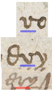
Overly Simple "r"
The "r" in "very" and "approued" in the inscription is different from the way that Henry Neville usually wrote his "r". I was able to find an example of "very" written by Henry Neville that has a similar-looking "r". The examples with the blue underline are from the inscription and the one in red is Henry Neville's handwriting:
In a draft letter I have also found several examples of Henry Neville writing an "r" that is much more similar to the style of the Sonnets inscription:

Here is the exact same letter formation, with an "r" that looks like a "v", I have underlined it in red:

Here is another example from 1604:

All of these are consistent with the inscription.
The above comparisons have been with Henry Neville's letters taken over a 15+ year period. I've tried to find the best matches, taking words from different letters.
Here, I would like instead to take just one letter, written to Julius Caesar, Chancellor and Under Treasurer of the Exchequer, on September 24, 1608. The date is close to the publication of the Sonnets in 1609, so it should be a good comparison. Here is the letter, I took this photo at the Berkshire Record Office:

This letter is written in Henry Neville's "formal secretary" handwriting; the inscription is perhaps in a bit more formal style. So there are strong consistencies but some differences. The matches here are less precise, but the overall impression is very strong. Here I compare the top line of the inscription with the letter:

Examining the 1600 letter to Robert Cecil
This letter from 1600 is written in Henry Neville's "super formal" style. He sometimes used this style in situations like these, where he was writing a letter of reference for someone. It is reproduced here with permission of the Marquess of Salisbury, Hatfield House.

Here are the comparisons. Note that this formal style has a different "e" and "h" than shown in the 1608 letter and shown on the transcription. Henry Neville varied these letters depending on the formality of the correspondence. So there are some obvious differences here in letter formation, but those are just variations in Henry Neville's handwriting:

Less formal letter to Robert Cecil from 1600
Here is another letter from 1600 to Robert Cecil in a less formal handwriting:

The correspondences are quite impressive, taken as a whole, but you can also see the variability within a single letter:

Control Samples - Overview
Now I will begin comparing control samples. Henry Neville wrote in a well-polished standard secretary hand and the Sonnets inscription was written in a well-polished standard secretary hand. One might think therefore that "anyone could have written it," but that is a mistake. Many people wrote in a well-polished standard secretary hand, but most did not and could not. So that alone excludes most people from possibly having written the inscription. Only someone with outstanding handwriting skills could have written the inscription.
That said, it makes no sense to compare the inscription with people's italic handwriting or extremely messy or non-standard secretary hand. Instead, I will compare it with good examples of professional-looking secretary writing from the period. It is more important to examine a few good controls than to compare against a wide cross-section of samples, since most handwriting samples aren't even close to a match.
Please note, even if you go through something like State Papers Online or Cecil Papers which have professionally written letters only 1/5 of them are anything close in style to the ones I will look at below. Most are written in italic, unpracticed secretary hand, or a secretary hand that is so idiosyncratic it isn't even passably similar to the Sonnets inscription and Henry Neville's handwriting.
Control Sample 1
This is good control sample because an extremely high resolution image of the letter is on the Folger Website. It probably was written out by a secretary. The handwriting is very similar in style and letter formation to Henry Neville's handwriting. Here is the body of the letter; I have circled the relevant sections:

The first line of the letter has similar wording to the inscription. "my very hearty commendations" is similar to "commendations to my very kind" on the inscription. Henry Neville used both "very hearty commendations" and "very kind commendations" in his letters; this was very common phrasing:

The first thing to notice is the spelling of "very". I have underlined it above in blue. Henry Neville, as far as I have seen, invariably spelled it "very", but this control sample has it spelled "verie". So that is one big, important difference from the Sonnets inscription. The letter formation is also completely different from the Sonnets inscription:

Beyond the spelling, the "v" is completely different as is the "e" and the "r". Of course, Henry Neville varied how he wrote those letters too, and I can show you examples of letters where he writes "very" closer to the Control Sample 1 than the inscription. But usually he wrote "very" in a similar way to the inscription, and as I said, as far as I know, always with a "y".

Of course, the "e" in "comendacons" in Sample 1 above is completely different from the inscription (Henry Neville used both types of "e"). The "d" though is more importantly different. The shape is different, there is no discernible loop, and the "n" and d" are not connected. The letter appears to be formed in a completely different way from the inscription. If you look through Control 1, the writer repeats that same style of word-medial "d". So that is a strong mismatch.
Compare the "my" in the inscription to the "my" in Control 1 with Henry Neville:

Control 1 has two examples of the "23"-style capital B. Compare them with the inscription on the left and two examples from Neville on the right:
Note how the inscription and Henry Nevile have a long and exaggerated based for the "2". Control 1 lacks that and has a clear separation between the "2" and "3". The inscription and Neville's samples connect them. Of course, the inscription has a loop on the "3" and I have not yet found an example of Neville making a "B" with such a loop; that is a discrepancy between Neville and the inscription.
Here are some comparisons of "and":
Note how Control 1 really has a completely unformed initial "a". The inscription and Henry Neville has much better formed "a" even though they share a line going over it.
Look at this example again, taken from a single letter written by Henry Neville in 1600. It is a *much* closer match for the Sonnets inscription than Control 1, even though overall, Control 1 and this letter have very similar style of handwriting:

Control Sample 2
Control Sample 2 was written by John Packer to Henry Neville in 1600. Packer was one of Neville's secretaries in France and continued to work for him for several years after. An incredibly able man, he rose to prominence later. You can read about him in the History of Parliament.
Henry Neville and the scribe of Control Sample 1 wrote in standard secretary hand. Packer wrote in a more idiosyncratic style. I think examining his letter will be enlightening:

Control Sample 2 has "very" in a very similar way to Sample 1, and completely different from the inscription (on top), though it is spelled with a "y". The "v" and "e" are of a different style and shape:

Sample 2 has a "23"-style capital B that is so stylized it is hard to even recognize; it is nothing like the one on the inscription. The word is "Besides" and I have underlined the "B":

"my" seems like a reasonably good match for the inscription, though the "y" is a little under-formed in comparison to both Neville's handwriting ant the two examples in the inscription:

"k" seems to be quite different however:
Control Sample 3 is also from the Folger Library. It is from a notebook from around 1601; it's the copy of a letter. The handwriting is quite distinctive and obviously too wavy to be similar to the Sonnets inscription, but there are some other characteristics I'd like to examine. Except for the waviness, the letter formation is similar to Henry Neville's:

Compare the "very" with the inscription to Sample 3:

The "and" in Sample 3 varies a good deal, but it is another example where it's obviously not a match:
There are several abbreviation marks which are quite similar to the ones we examined from Henry Neville above:

The word "comende" above gives us a chance to compare with "comendacons" from the inscription. Note how different the 'd" is. The "m" is similar in the first example but quite different in the second two.
Conclusion
I believe this raises the substantial possibility that Henry Neville did, indeed, write the inscription on the copy of Shakespeare's Sonnets at the Rylands library. I look forward to feedback from experienced paleographers. You can email me kenfeinstein (at sign) gmail com.
Please check out my handwriting analysis of the Northumberland Manuscript.